

Integrating corporate design into exhibition stands effectively: A guide to creating strong brand presentations
Corporate identity at the exhibition stand: It’s not just about the logo and colour
Corporate design encompasses all the visible features of a brand, namely the logo, colours, typography, visual language, materials, shapes and tone. At the exhibition stand, these elements come together to create a three-dimensional experience that brings the brand to life. A consistently implemented Corporate identity It creates brand recognition across different trade fairs, cities and countries, whilst also building trust, as the trade fair presence is consistent with other touchpoints such as the website, brochures or showroom. Furthermore, it makes it easier for visitors to find their way around, as they can recognise at a glance who you are and what your company stands for.
At the same time, it supports sales and consultancy, as the space itself visually conveys the topics, areas of expertise and solutions you offer. It is particularly in highly competitive exhibition halls, with hundreds of rival stands, that it becomes clear just how important a clearly organised Corporate identity at the exhibition stand is: It distinguishes visual noise from targeted brand presentation and makes your Brand identity clear, memorable and professionally presented.
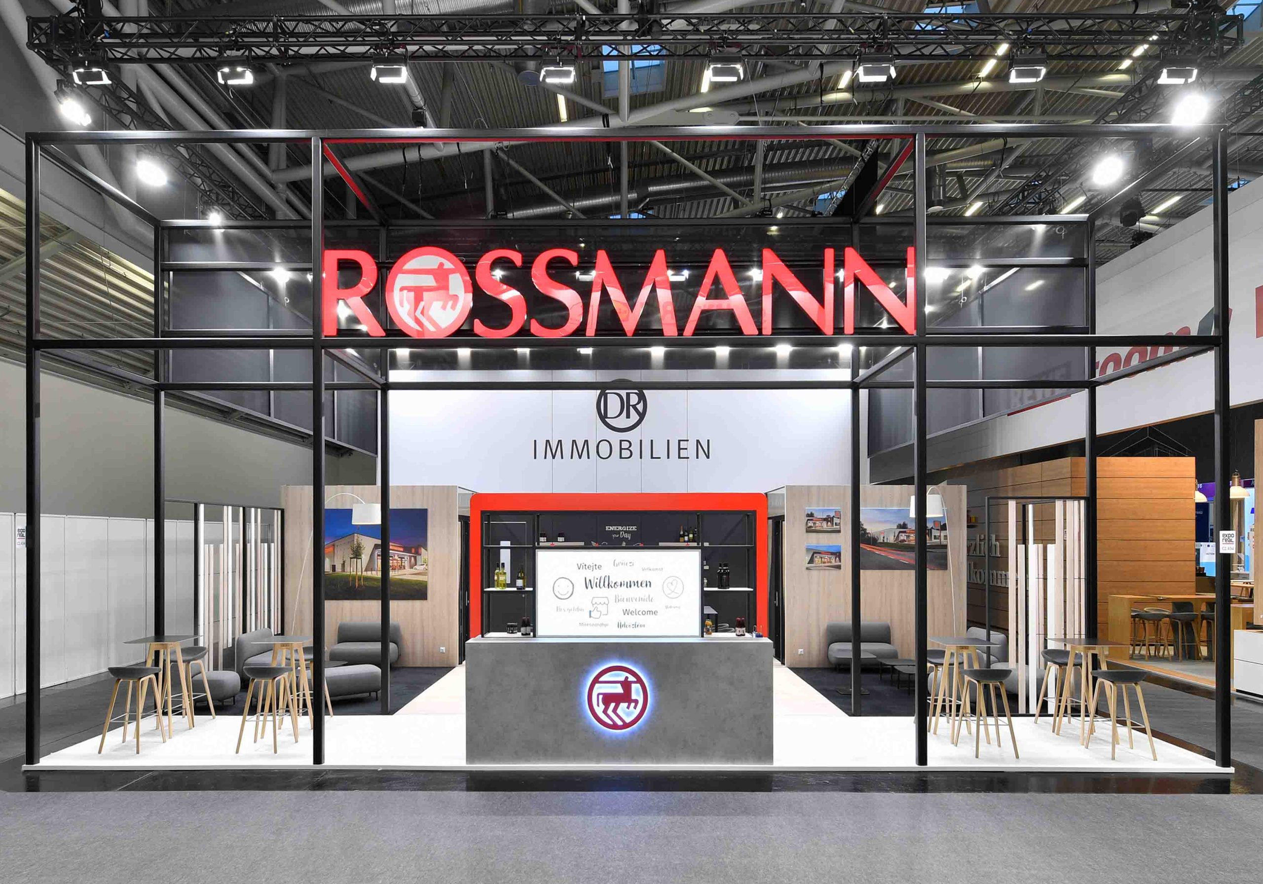
From CD manuals to interior design: How we translate corporate design into architecture
At sectorplan GmbH, we take a structured approach to this:
1. Analysis of the brand guidelines
We review logo guidelines, colour values, corporate typefaces, visual style and tone. It is important to identify which elements are non-negotiable and where there is scope for creative interpretation.
2. Translation into spatial principles
We derive design principles for volume, line work and zoning from colours, shapes and images. A dynamic brand will have a different stand design to a tradition-oriented company.
3. Development of a stand concept using a modular system
With modular systems such as the Aluvision stand construction, which we use as Aluvision Ambassador By making the most of this, we implement your corporate design with precision and, at the same time, in a sustainable manner. We adapt the frame dimensions, fillings and finishes to match your brand image visually, without compromising the system’s flexibility.
4. Media technology and content in the CD
LED screens, presentations and interactive applications all follow the same corporate identity guidelines. Content, animations and videos only come together effectively when the colour scheme, typography and visual style are consistent. Our team is here to support you with Exhibition technology and media technology.
The aim: an exhibition stand that feels like your brand – not like a generic modular stand with logos placed at random.
Elements of a strong corporate design exhibition stand
To ensure that a corporate design exhibition stand To make a professional impression on trade visitors, it takes more than just logos repeated on the walls. Key elements of stand design include:
Colour and material scheme
Their primary colours form the basis. Secondary colours, and surfaces made of wood, metal or fabric, complement the overall look and convey brand values such as high-tech, naturalness or premium quality.
Design language and architecture
Rounded elements, clean lines, diagonal accents or exposed edges – every shape subconsciously conveys a message. We incorporate system profiles, frames and ceiling elements into this design language.
Typography and Information Design
Typography must not only be in keeping with the brand identity, but also legible from a distance. Here, we draw on design guidelines: the hierarchy of messages, reading distances and contrast ratios. Headlines, subheadings and product information follow a clear structure.
Visual elements, icons and pictograms
Whether it’s photography, illustration or technical graphics – the visual language conveys whether your brand comes across as emotional, factual, technical or lifestyle-oriented. Pictograms help to make complex topics easy to grasp.
Lighting in line with the corporate identity
Light colour, light intensity and the use of accent lighting shape the ambience of a space. Cool light complements high-tech brands, whilst warm light suits the hospitality, food or lifestyle sectors. Indirect lighting features in corporate colours subtly reinforce the corporate identity.
Staff and clothing
Corporate design doesn’t stop at the edge of the stand. The stand team’s clothing, name badges and accessories all form part of the overall picture. This creates a consistent brand image across all levels.
Corporate design at the system stand: brand recognition through modular flexibility
Many exhibitors are relying on Exhibition stand construction with a system, in order to make flexible use of space, reduce transport costs and operate in a more sustainable manner. The challenge: the stand must not look like a generic modular stand.
Using Aluvision systems and modular components, we design your Corporate identity at the exhibition stand in such a way that the system structure either blends invisibly into the overall picture or is deliberately showcased as a design element. Reusable frames can be flexibly configured with a variety of fillings, whilst LED panels, textile prints and hardboards are colour-fast and coordinated in line with the brand identity. This results in a concept that can be easily adapted to different exhibition venues and stand sizes. A well-thought-out CD concept serves as the unifying element, whilst the modular framework ensures cost-effectiveness and adaptability. Content, graphics and spatial zones can be adapted for new trade fairs without the Brand range to break through.
Corporate design and sustainability in exhibition stand construction: not a contradiction
More and more marketing managers are linking a clear corporate design exhibition stand with the right to Sustainable exhibition stands. This is precisely where one of sectorplan GmbH’s strengths lies.
This is how we connect CD loyalty and sustainability: Reusable system frames reduce material consumption, whilst interchangeable graphic panels and printed textiles allow for design updates without the need for a complete rebuild. High-quality materials also extend the service life of the stand components, and standardised modules facilitate storage, transport and subsequent reuse at in-house exhibitions or roadshows. At the same time, sustainability also has a substantive impact on the Corporate identity … as many brands deliberately incorporate themes such as the circular economy, renewable energy and resource efficiency into their visual identity and storylines. As a result, the exhibition stand is not only designed to be functional and resource-efficient, but also serves as a stage for a credible sustainability communication.
Practical example: Planning a corporate-design exhibition stand step by step
To make it easier to visualise how this can be applied in day-to-day project work, we’ll use a typical workflow that we employ with many of our clients:
1. Defining objectives and the briefing
Working alongside the marketing and sales teams, we define trade fair objectives, target audiences and key themes. At the same time, we compile all corporate identity guidelines and previous trade fair experiences. Anyone wishing to delve deeper into the strategic preparation process will find our guide useful Trade fair planning.
2. Site analysis and site type
We assess the stand’s location, neighbouring stands, sightlines and visitor flow. Based on this, we determine the floor plan, stand type (row, end, corner or island stand) and the brand’s zoning strategy.
3. Design in line with the corporate identity
Our designers develop 3D concepts that incorporate all aspects of the corporate identity: architecture, graphics, lighting, media technology and furniture. In doing so, we ensure that the concept remains scalable for future trade fairs.
4. Detailed planning and audiovisual technology
The draft is developed into a technical plan with precise dimensions, the locations of media surfaces, power connections and exhibits. We tailor the content of the LED video walls to the corporate design – the visual language, typography and animations follow the same style as our print and web materials.
5. Production, set-up, on-site support
In our workshops, we manufacture wooden and signage components whilst system components are being prepared. On site, our teams ensure that the stand is erected on schedule, that the audiovisual equipment is tested, and that the exhibition stand corresponds exactly to the approved design.
Corporate design in exhibition stands to suit different business objectives
Not every exhibition stand has the same objectives. Depending on its focus, we interpret the Corporate identity to varying degrees. When it comes to increasing brand awareness, visibility is the key priority: large logo areas, striking blocks of colour and a clear core message make the stand stand out as a spatial Branding statement play a role. In the case of a product launch or the presentation of an innovation, however, the corporate design sets the scene, whilst a specific product or technology takes centre stage. Graphics, lighting and media then direct attention specifically towards defined launch zones. In the field of lead generation and consultancy, calm, brand-compliant consultation areas are becoming increasingly important, because here the corporate design (CD) primarily Expertise and reliability is intended to convey a message, whilst backwalls and media displays are designed to provide targeted support for sales discussions.
When it comes to employer branding – for example, at careers fairs or in specialised formats – values, corporate culture and a human touch play a particularly important role. The colours, imagery and tone of voice used in the corporate design emphasise approachability and appeal as Employer. This shows that a good corporate design is not applied rigidly, but rather emphasises different aspects depending on the objective, without Brand identity to lose. Whether you’re planning trade fairs in Munich, Frankfurt or Stuttgart – with our network and locations, we’ll support you in Exhibition stand construction in Munich, Exhibition stand construction in Frankfurt and Exhibition stand construction in Stuttgart with a consistent corporate identity.
Maintaining a consistent corporate identity: common mistakes and how to avoid them
In the day-to-day running of a trade fair, it is common for Stumbling stones which the CD release weaknesses. Our aim is to anticipate these challenges right from the start and resolve them in a well-thought-out manner. A key issue is the poor colour accuracy, as printing on different materials, varying lighting conditions in exhibition halls and coloured floor coverings can significantly alter the perception of a company’s corporate colours. We therefore take such factors into account right from the planning stage and make specific adjustments to print profiles and lighting. Overloaded graphics are just as problematic: too many messages, varying font sizes and inconsistent visual styles quickly lead to visual overload. In our design concept, we therefore prioritise the Key messages, simplify visual concepts and create clear hierarchies of information.
Also inconsistent media content can disrupt the visual style, for example when presentations are incorporated with the wrong aspect ratio, using a different font, or as a result of ad hoc stopgap solutions. That is why we develop standardised templates for presentations, videos and animations that consistently adhere to the corporate design. Added to this are ad hoc additions at the stand, such as extra roll-ups, self-printed signs or displays erected at short notice, which can quickly disrupt the overall look. To avoid this, we incorporate reserves and modular spaces into our planning from the outset, so that even spontaneous adjustments can be managed and in line with the brand can be integrated.

Would you like to plan your next trade fair appearance?
Frequently asked questions about corporate design at exhibition stands
Corporate design at a trade fair stand encompasses all the visual elements a company uses to present its brand in a trade fair setting: logo, colours, typography, imagery, materials, shapes and media technology. A consistent corporate design exhibition stand ensures that visitors can identify the stand at a glance, recognise the brand and enjoy a consistent experience across all channels.
A well-executed corporate design makes your exhibition stand stand out and be easily recognised in the exhibition hall. It boosts brand recognition, builds trust and supports your sales objectives. When architecture, graphics, lighting and media technology are combined in a way that Corporate identity at the exhibition stand When designed in this way, the presentation comes across as professional, focused and memorable.
A modular exhibition stand system allows you to combine flexibility with brand impact. System frames such as Aluvision form the supporting structure, whilst printed fabric panels, panels and LED elements convey your corporate identity. This allows you to use a modular exhibition stand across different spaces without losing your visual identity. sectorplan relies here on a consistent corporate design exhibition stand, which can be scaled up or down from one trade fair to the next.
Sustainability in exhibition stand construction influences the choice of materials, construction methods and communication. Reusable systems, durable surfaces and interchangeable graphic panels reduce resource consumption and costs. If sustainability is part of your brand values, this is reflected in your corporate design – for example, through the visual identity, messaging and choice of materials on the exhibition stand. A sustainable stand that is consistent with your brand strengthens credibility and brand image.
To ensure colour-accurate corporate design at the exhibition stand, standardised colour values, coordinated print profiles and material samples are crucial. During the planning stage, we test prints on the actual materials and assess their appearance under trade fair lighting conditions. Logos are allocated defined clearance areas and minimum sizes to ensure they appear clear and crisp on all graphic elements. This results in a corporate design exhibition stand, which complies with the CD specifications in practice.
Yes, a well-structured corporate design works regardless of the exhibition venue or stand size. With a modular stand design, clearly defined graphic elements and flexible media technology areas, your exhibition stand can be adapted to suit different spaces in Munich, Frankfurt, Stuttgart or anywhere else in the world. sectorplan develops concepts that will corporate design exhibition stand maintain consistency across all locations whilst still taking account of the specific conditions at each trade fair.
Start with a structured briefing: trade fair objectives, target audiences, stand size, budget and your corporate design guidelines form the basis. Supplement this with insights gained from previous trade fairs. On this basis, we at sectorplan GmbH will develop a spatial concept that combines corporate design, visitor flow and technical requirements. You’ll find useful background information in our article Exhibition Stand Design, which describes the process from the briefing to the finished stand.
